Shopify Store Design: Visual Toolkit for High Conversion
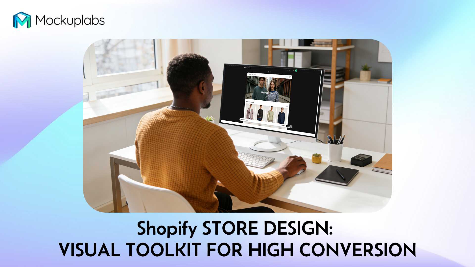
Table of Contents
- Why "First Glance" Determines Conversion
- Shopify Storefront Builder: Your Brand Headquarters
- Landing Page Builder: Targeted Conversion Design
- Synergy: The Storefront and Landing Page Loop
- Conclusion
- Frequently Asked Questions
Even the most innovative product will struggle to sell if potential customers are unimpressed within seconds of landing on your site. For Shopify merchants, your visual infrastructure—comprised of your main Storefront and specific Landing Pages—is the engine of your business.
Shopify store design is not just about making things look pretty; it is about building a cohesive journey that builds trust immediately. By mastering these two tools, you create a professional brand presence that converts visitors into buyers.
Consequently, building a strong visual foundation is the most critical investment for new sellers. Let’s explore how to utilize Storefronts and Landing Pages to secure your brand’s success.
Why "First Glance" Determines Conversion
The digital marketplace is crowded, and attention spans are shorter than ever. In fact, research suggests that users form an opinion about your website in about 0.05 seconds.
This rapid cognitive path moves from the initial visual impact of the first screen to a quick scan of headers, leading to an immediate decision: stay or leave. Therefore, your visual assets must do the heavy lifting before a single line of text is read.
While your storefront is responsible for the overall brand reputation, your landing page handles specific campaign impressions. Both must work in tandem. Neglecting one for the other is a common pitfall in Shopify website design.
Shopify Storefront Builder: Your Brand Headquarters
Your Storefront is your digital flagship. It is where long-term brand equity is built.
Core Structure and Visual Hierarchy
A high-performing Storefront generally follows a proven architectural flow:
- Header: Navigation, Search, and Cart.
- Hero Banner: The decisive "First Impression" zone.
- Featured Products: The primary shopping aisle.
- Trust Elements: Reviews, USP icons, and guarantees.
- Footer: Retention links and information.
Each section plays a distinct psychological role. The Hero section determines if they stay, while the trust elements determine if they dare to pay.
Visual Strategies for High-Conversion Homepages
To maximize retention, your hero banner requires a clear value proposition paired with a high-quality visual scene. Avoid clutter, giving your "Shop Now" button room to breathe.
Furthermore, rethinking your featured products section is vital. Instead of relying solely on plain white-background thumbnails, mix in lifestyle shots.
This is especially relevant for some sellers on Shopify. You need to visualize the "digital experience." By using a screen mockup suite, you can display your mobile interface on a phone and your analytics on a desktop simultaneously. This tangible proof builds credibility instantly.
Unified Brand Systems: Colors and Mockups
Consistency breeds trust. If a visitor sees different color palettes on your homepage versus your product page, they may subconsciously doubt your legitimacy.
Your font choices, logo style, and primary colors must extend into your product imagery. When creating marketing assets, ensure the props and backgrounds in your photos match your brand palette.
Fortunately, you don't need a studio for this. You can use a smart color changer or background remover to adjust the colors of objects or backgrounds within a mockup. This ensures a seamless look across your entire store.
Common Design Mistakes to Avoid
Even with great tools, Shopify store design best practices are often ignored. Watch out for these three errors:
- Visual Disconnect: The Hero image style clashes with product photos, creating a "jagged" experience.
- Mobile Neglect: Images that look great on desktop but are cropped awkwardly on mobile screens.
- Repetitive Clutter: Using the exact same mockup angle ten times in a row, causing visual fatigue.
To fix this, define a style guide before you start. Always preview your design on mobile devices, and curate your visuals to feature only your strongest 1-2 assets per scroll depth.
Mockup Ideas for Different Niches
Different products require different visual storytelling techniques.
- POD (Print on Demand): Use a unified canvas to show your design on a mug, a mousepad, and a t-shirt simultaneously to suggest a "collection."
- Apparel: Combine flat-lays with "Outfit of the Day" style street shots.
- Home Decor: Use "Before and After" visuals to show transformation.
For instance, a merchant using Mockuplabs.ai can drag and drop multiple apparel mockups onto a single infinite canvas. This allows them to design a coherent "family" of images for their homepage sliders without constantly switching files.
Need Professional Store Visuals Fast?
Stop struggling with complex design software. Mockuplabs allows you to create stunning, high-resolution mockups for your Shopify store in seconds directly in your browser.
Landing Page Builder: Targeted Conversion Design
While the Storefront informs, the Landing Page (LP) converts.
Landing Page vs. Storefront: The Distinction
Your Storefront serves all visitors, acting as a library of your offerings. Conversely, a Landing Page has a singular focus: converting traffic from a specific ad or email into a sale.
Whether it is a Black Friday deal or a new product drop, the visual layout must be distraction-free. The navigation bar is often removed to keep the user focused on the Call to Action (CTA).
The Three-Segment Structure
A high-converting LP typically follows a linear narrative:
- The Hook (Segment 1): A website mockup or hero shot that explains "What is this?" and "Why do I need it?" in under 3 seconds.
- The Value (Segment 2): 3-5 distinct sections using visuals to prove the product's benefits. Use close-ups and lifestyle context here.
- The Action (Segment 3): A final, undeniable offer paired with social proof visuals, such as a tweet or review overlaying a product shot.
Mockup Strategies for Campaigns
Your visuals should match the emotional goal of the campaign.
- New Launch: Use high-contrast macbook mockup visuals to make the new feature pop against a dark background.
- Flash Sale: Utilize urgent colors (reds/oranges) in your mockup backgrounds to signal scarcity.
- Seasonal: Inject "vibe" into your design. For a summer sale, place your digital product on a table with sunglasses and iced coffee using a scene generator.
When asking "how can i find design ideas for my shopify store", look at your competitors' landing pages. You will likely see they use simplified, isolated product renders to keep the focus entirely on the purchase button.
Instantly Customize Your Brand Assets
Consistency is key to conversion. Our Smart Color Changer lets you align every mockup with your Shopify theme’s color palette instantly, ensuring a seamless brand experience.
Synergy: The Storefront and Landing Page Loop
The relationship between your Storefront and LPs is cyclical, not linear.
A typical user journey might begin with a Facebook ad leading to a specific Landing Page. After the initial purchase, that user returns weeks later directly to your Storefront to browse. If the visual quality drops between the LP and the Homepage, trust is eroded.
Moreover, your Landing Pages are excellent testing grounds. Run A/B tests on your LPs to see which mockup templates yield the highest click-through rates. Once you identify a winning visual style, "graduate" that design to your main Storefront Hero section.
Conclusion
Storefronts and Landing Pages are the twin pillars of your e-commerce visual infrastructure. While they serve different purposes—brand identity versus focused conversion—they must speak the same visual language.
By adhering to a clear structure, utilizing high-quality website mockup tools, and maintaining brand consistency, you can capture attention instantly. The result is a store that looks professional, builds trust, and drives revenue.
Frequently Asked Questions (FAQs)
Q1. Should my Landing Page design style be exactly the same as my Storefront?
While the core brand elements (fonts, logo, primary colors) should remain consistent to ensure trust, the layout should differ. Landing pages should be more simplified with fewer distractions (like navigation menus) compared to your Storefront.
Q2. I have a limited budget; how can I improve my Shopify store design?
Focus your energy on high-impact areas first: the Hero Banner and the Featured Products section. Instead of hiring an expensive photographer, use a mockup generator to create professional lifestyle images for your digital or physical products at a fraction of the cost.
Q3. What are the best design tips for my online store if I am not a designer?
Stick to the "less is more" principle. Use high-quality imagery, plenty of white space, and a maximum of three main colors. Utilize tools like Mockuplabs to generate professional visuals without needing Photoshop skills, ensuring your store looks premium from day one.
Q4. How can I quickly change the color of assets used in my Shopify store without complex software?
Use an online color changer tool. Upload your image, use the auto-mask feature to select an area, and adjust hue, saturation, or brightness for a quick visual update.
Q5. Is it effective to change the background color of product photos for different campaigns?
Yes. Automated tools can instantly isolate the background. You can then apply a new campaign color or remove the background entirely for a transparent image.
Q6. Can I recolor specific items like clothing or accessories in my product mockups for variant presentation?
Absolutely. Advanced editors use AI edge-detection to precisely select details like clothing. This allows you to realistically change the color to showcase different product variants instantly.